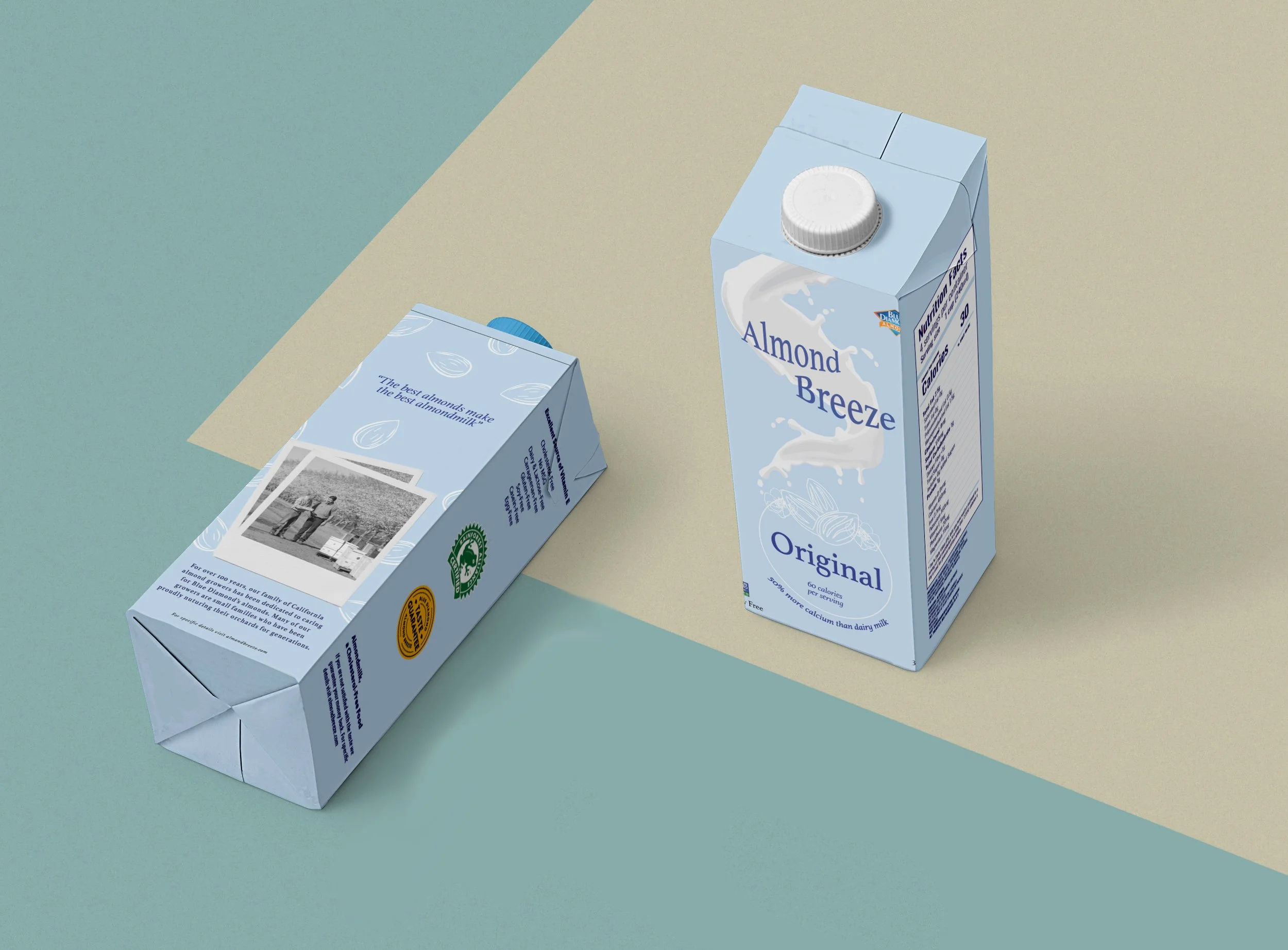
The Redesign of Almond Breeze Milk
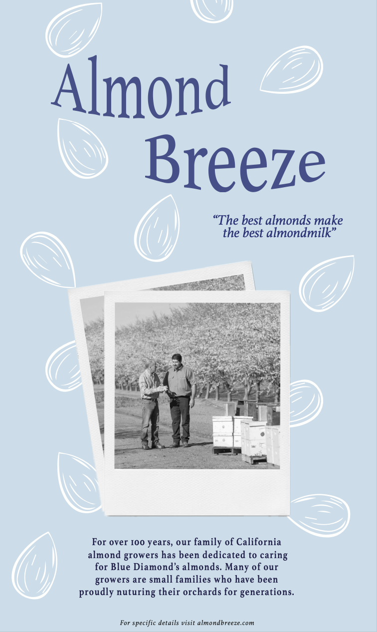
Almond Breeze, a beloved family brand renowned for its almond milk beverages, sought a packaging overhaul to declutter its design and reconnect with consumers through its rich heritage of blue almond farmers' stories.
The Task
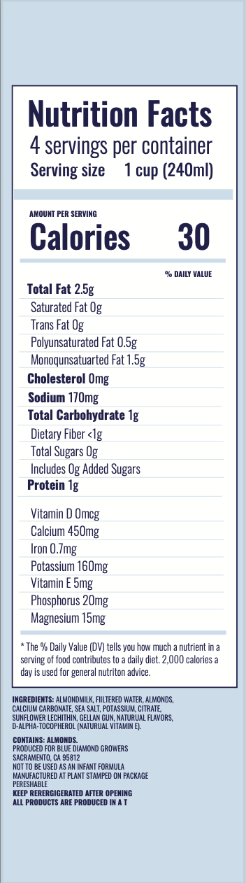
To revamp Almond Breeze's packaging, I needed to carefully go through the current design to see what wasn't working anymore, which also included the information on the packaging. This involved doing research, listening to what others around me had to say, and trying out new design ideas. I kept what was important to the brand while adding new, exciting elements. This approach helped us create packaging that stayed relevant and appealed to consumers in today's ever-changing market.

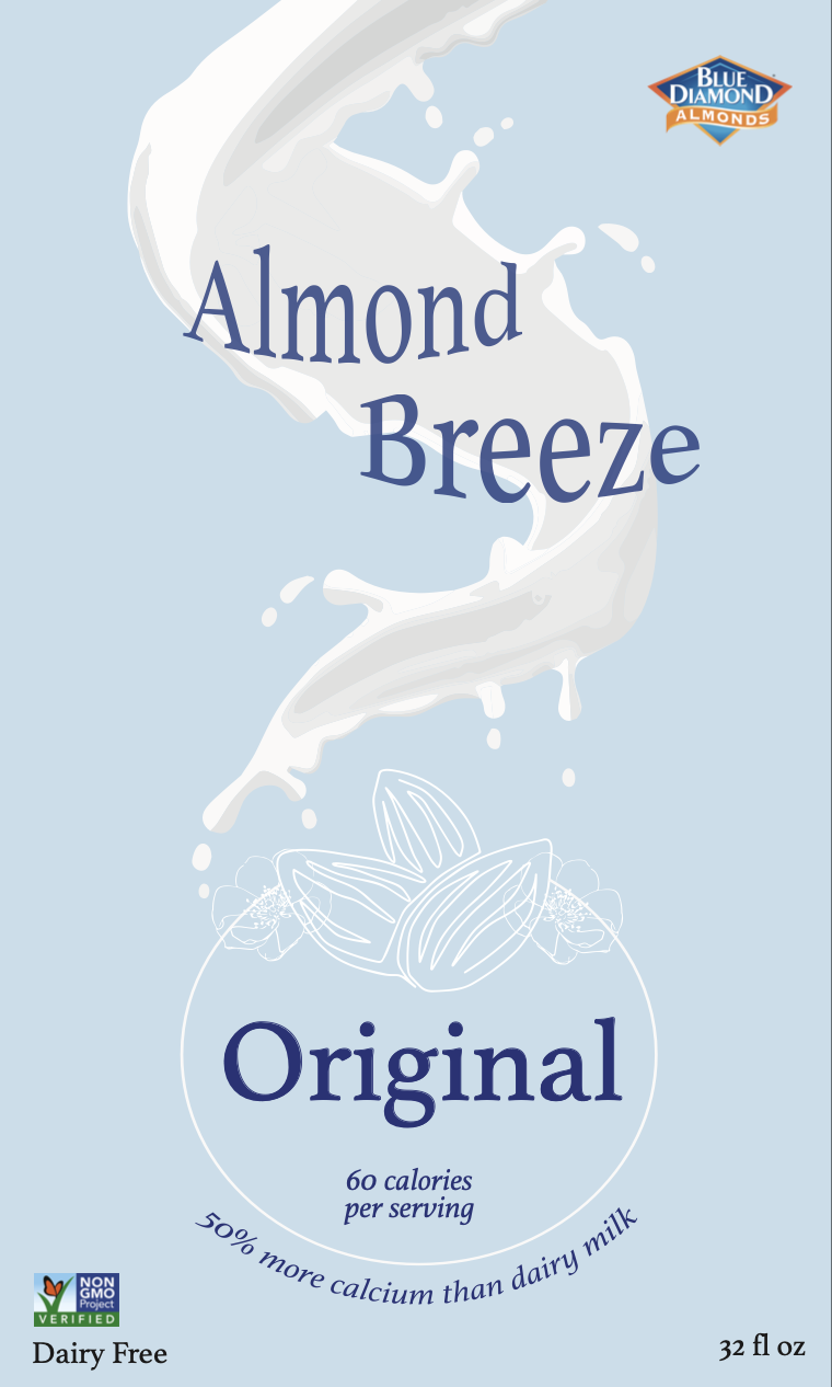
The Color
The decision to retain a shade of blue for Almond Breeze's packaging was rooted in a desire to honor the brand's legacy while embracing a fresh direction. Opting for a lighter tone maintained continuity with the brand's iconic color identity while infusing a sense of renewal. This subtle shift allowed for a seamless transition, signaling a new chapter for Almond Breeze while staying true to its roots. To enhance the packaging's appeal, new design elements were introduced to inject vibrancy and visual interest, ensuring that the brand remained captivating and relevant in the competitive marketplace.


The Type
In the process of redesigning the packaging for Almond Breeze, careful consideration was given to the choice of font and typeface. A diverse range of options, including both serif and sans-serif fonts, were studied extensively to determine the best fit for the brand's new identity. Initially drawn to the elegance of Didot and the modern appeal of Aroma Madurai, further exploration revealed the enduring charm of classics such as Athelas and Helvetica. Each font brought its own unique qualities to the table, from the refined sophistication of serif fonts to the timeless versatility of sans-serif options.