The Redesign of Polar Seltzer packaging
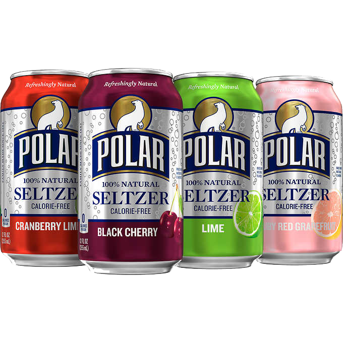
Polar Seltzer, a beloved brand known for its refreshing seltzer beverages, was in need of a revamp. The goal of changing up the can design was to better reflect the essence of their product: crispness, flavor, and vibrancy. As part of this project, I aimed to create a visually appealing design that not only stands out on the shelves but also communicates the variety of fruit flavors offered by Polar Seltzer.
Maintaining Brand Essence
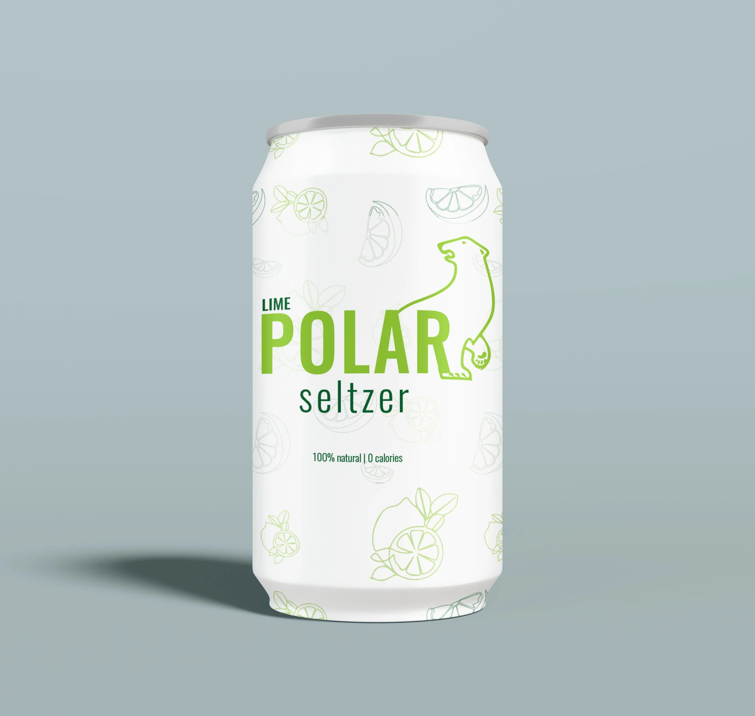
Understanding the importance of preserving Polar Seltzer's brand heritage, we carefully examined key elements that defined its identity. The iconic Polar bear logo, synonymous with the brand, remained at the forefront of our design. However, we opted to refine it, simplifying the illustration to a clean outline while ensuring its unmistakable charm and personality persisted. This subtle alteration retained the essence of the brand while infusing it with a modern touch.

Freshness and Vibrancy
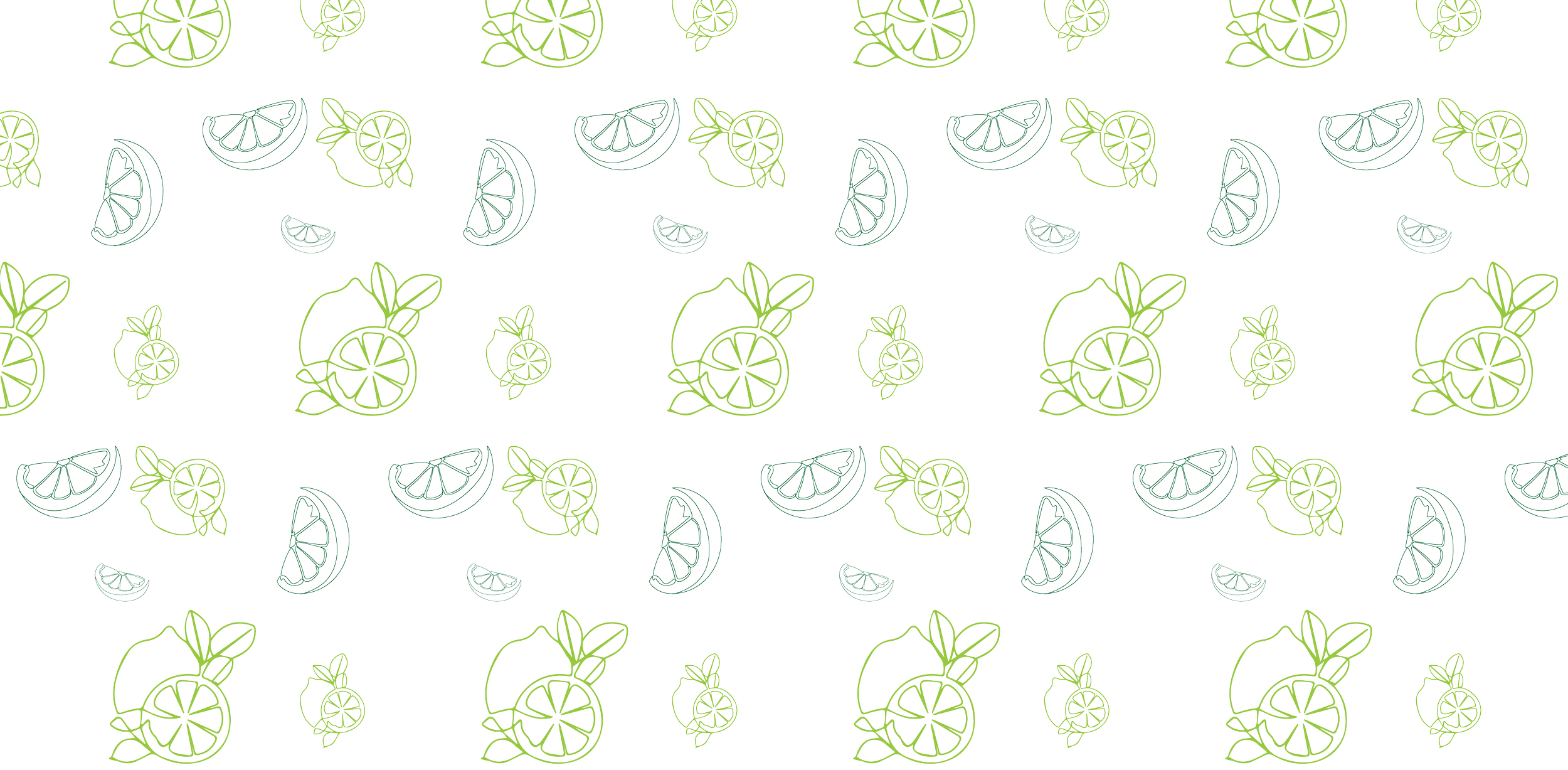
Recognizing the need for a rejuvenated aesthetic, we developed a design concept that celebrated Polar Seltzer's diverse fruit flavors. Our approach centered on simplicity, cleanliness, and a touch of whimsy. We envisioned each can as a canvas, adorned with vibrant fruit illustrations that served as visual cues for the flavor within. By incorporating these illustrations directly onto the can, we aimed to streamline the consumer experience, allowing for quick and intuitive flavor identification.
Color and Type
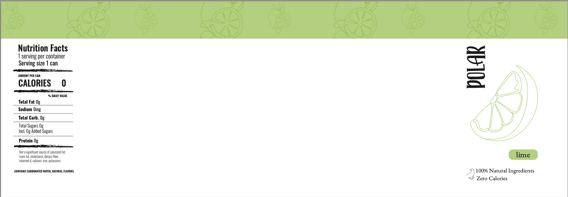
Centered around the refreshing lime flavor, the design embodied a blend of freshness, vitality, and refinement. The juxtaposition of light and dark greens in the line art added depth, drawing consumers into the essence of lime. Paired with the sleek and modern Oswald font, our design achieved a harmonious fusion of style and functionality, effectively captivating attention on store shelves.

After exploring various font options, Oswald stood out as the clear choice due to its clean lines, contemporary feel, and well-proportioned design. Its adaptability seamlessly complemented our overall vision, ensuring both readability and visual impact. By utilizing the Oswald font family, we maintained a cohesive look across the label while having the flexibility to adjust hierarchy and emphasis as necessary.

Ready for the results?
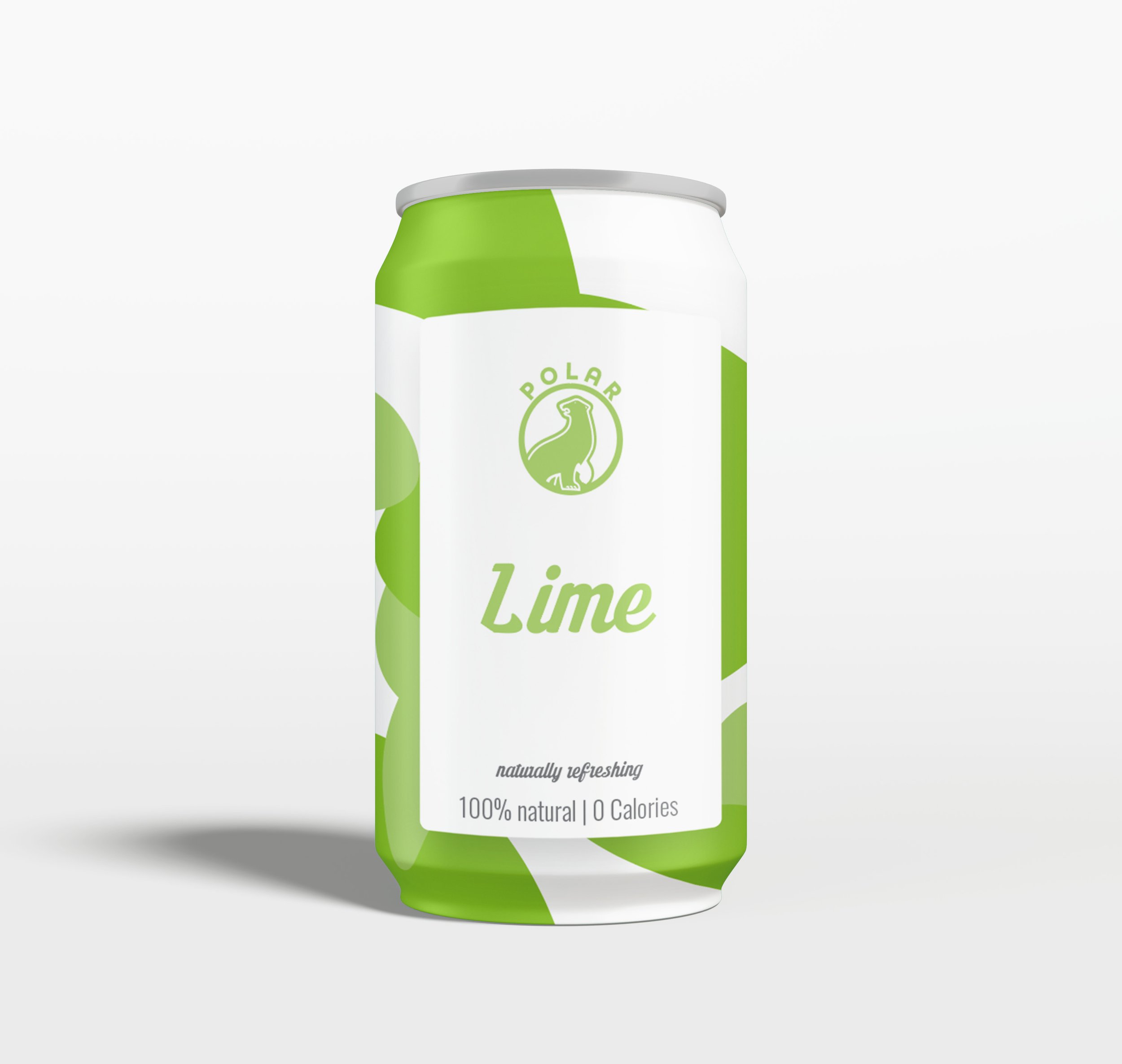
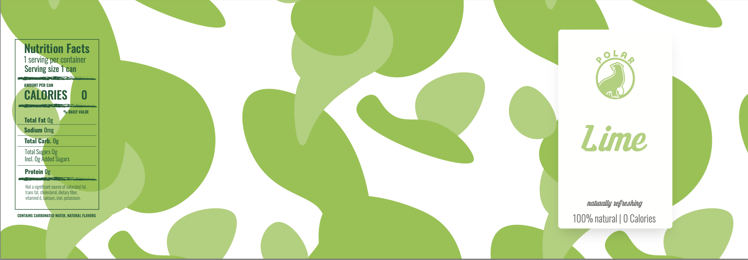
For reference here is the original…
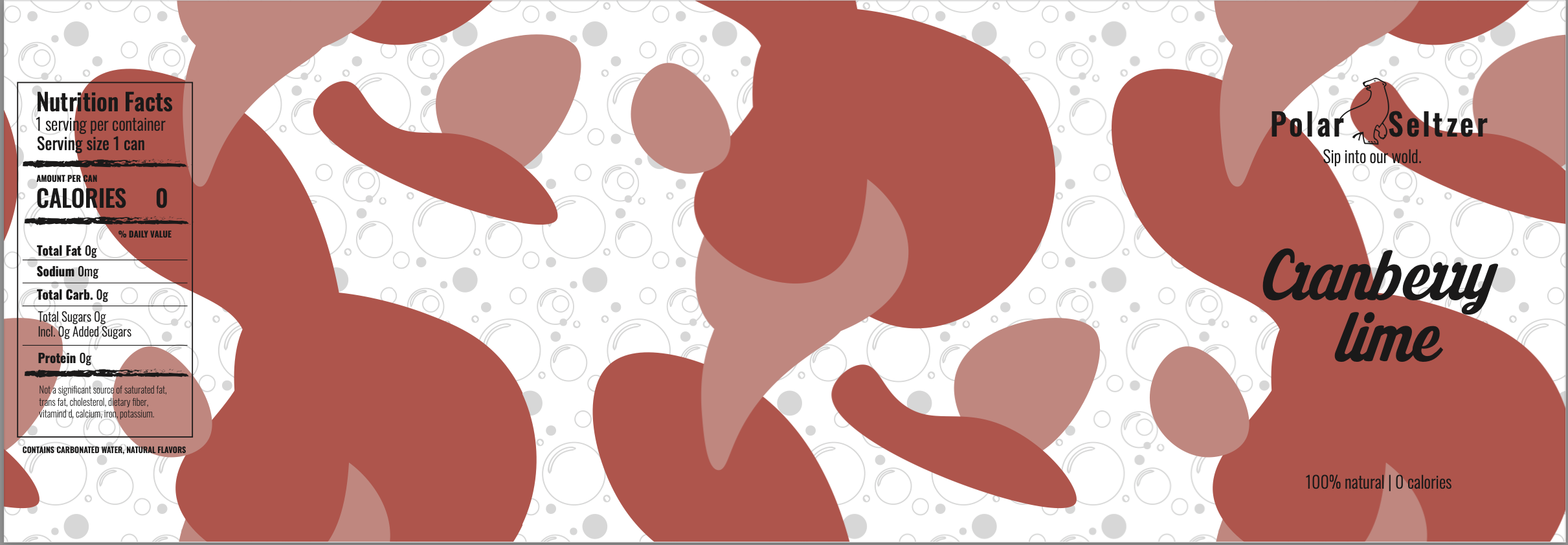
The Runner Up
In the redesign journey for the Polar Seltzer can, we experimented with various composition styles. Some designs featured intricate, dynamic displays surrounding the can, adding flair and excitement. Others took a minimalist route, with solid backgrounds allowing the fruit illustrations to stand out. Ultimately, we found a balanced approach, blending elements of complexity and simplicity to create a polished design that highlights the brand's identity and diverse flavors.
One of the redesigns that almost took the lead was….