
The Creative Journey of Designing the New York Fashion Week Calendar
Designing a calendar for New York Fashion Week was an exciting adventure filled with passion and purpose. It wasn't just a task; it was a chance to explore the world of fashion and discover what makes it beautiful. The challenge was to look through a variety of design ideas and find the ones that would make the calendar special. It wasn't just about picking pretty pictures; it was about creating a vision that would guide the project in the right direction.
Challenges
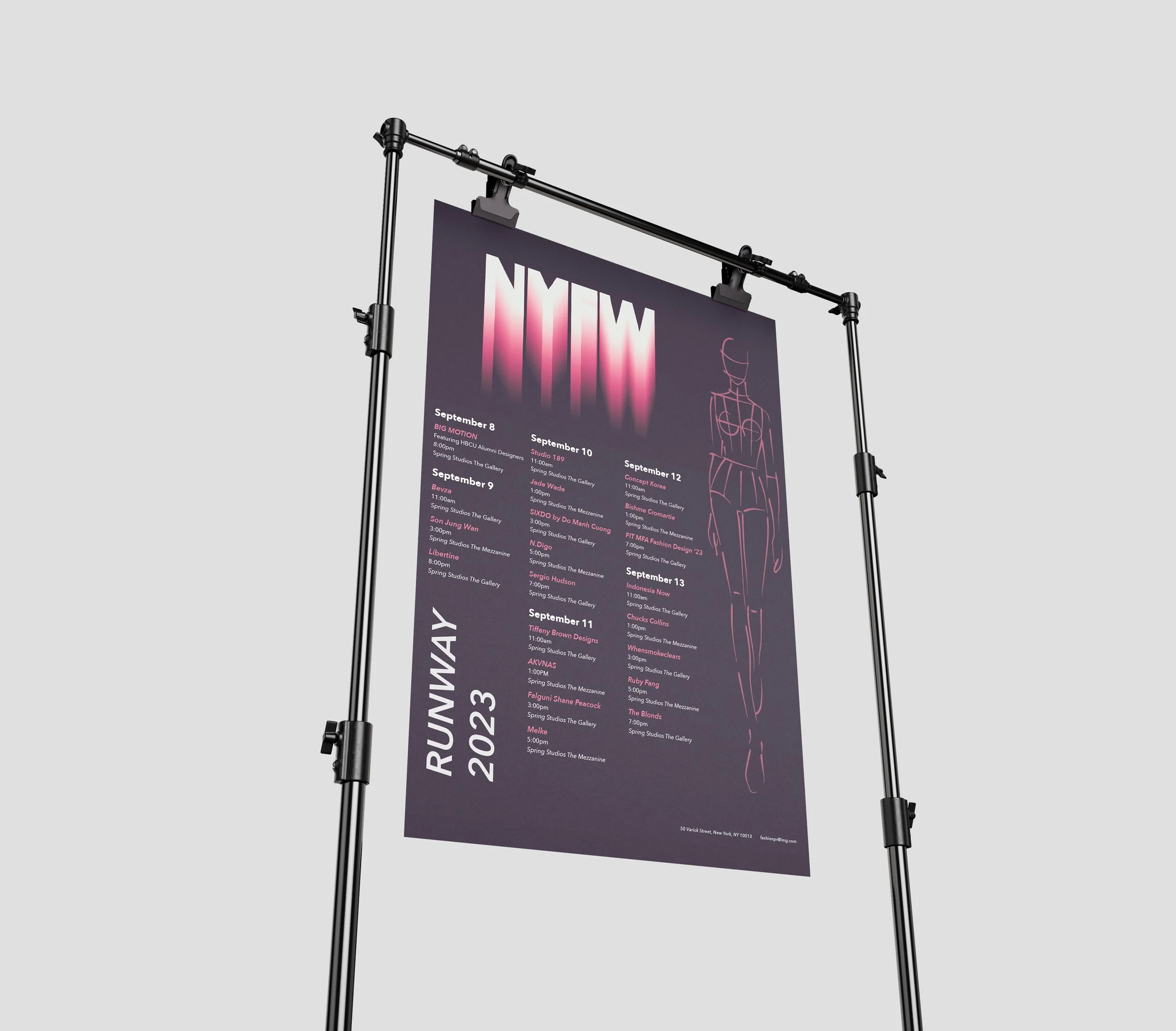
Crafting the calendar presented several unique challenges, among them being the need to effectively organize and present a vast amount of information in a way that was both cohesive and easily digestible. With New York Fashion Week spanning just seven days but bursting at the seams with events from runway shows to artist interviews and intimate showcases narrowing down the focus was essential. To tackle this, I decided to prioritize highlighting the most significant runway walks, both on-site and at specific locations, creating a clear hierarchy of information that ensured the key events stood out amidst the hustle and bustle.
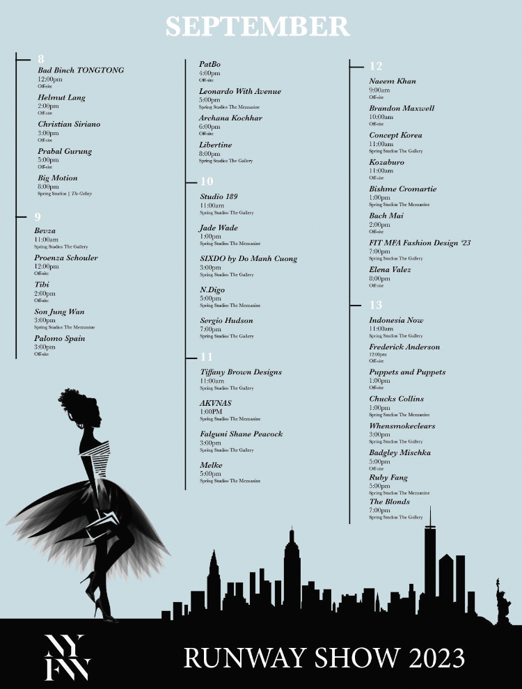
Another hurdle I faced was capturing the essence of the high-stakes fashion industry while maintaining a design that was simple yet impactful. Drawing inspiration from the drama and excitement synonymous with fashion, I opted for bold coloring, with a dark navy backdrop setting the stage for vibrant pops of fuchsia pink. This unconventional choice stemmed from my childhood memories of twirling in pink dresses, injecting a sense of nostalgia and playfulness into the design that felt both contemporary and authentic.
Finding Inspiration
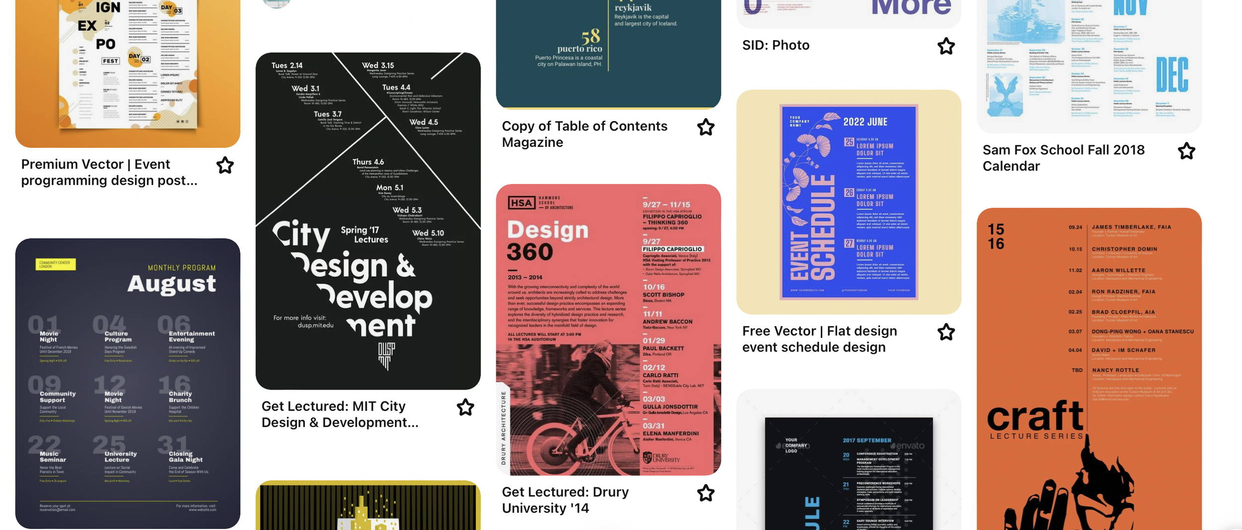
Pinterest was a goldmine of inspiration, offering countless design styles and layouts. Among the many ideas, I was drawn to calendars that combined big, bold dates with subtle text. I also liked the contrast between monochrome backgrounds and splashes of color. This guided the visual style of our calendar.
Color and Type
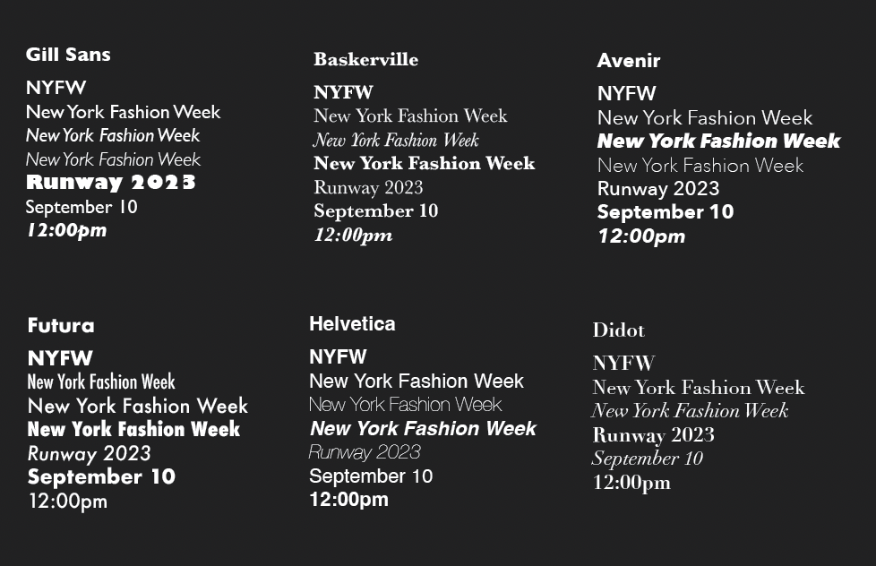
When selecting fonts, I looked for versatility. Avenir and Baskerville stood out because they mixed well with the high-fashion vibe of our project, combining modern and vintage looks. This choice added depth to our design, making it visually rich and flexible.
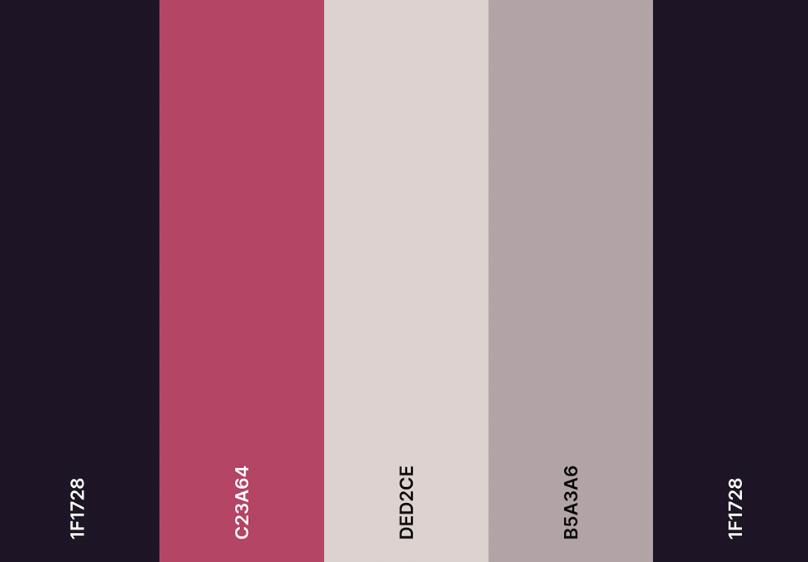
Color-wise, I leaned towards purples and pinks, colors that speak to the heart of fashion and also have personal meaning to me. This wasn’t just about looks; it was about connecting personally with the project, creating a calendar that welcomes viewers into the vibrant world of fashion.
Design Principles in Action
Alignment:
When crafting the New York Fashion Week calendar design, alignment was key. It helped create a layout that was organized and visually pleasing. By making sure important elements like event names, dates, and locations lined up nicely, I made it easy for viewers to follow along. This careful alignment didn't just make the calendar look good; it also made it easier to read and navigate, enhancing the overall user experience.
Harmony:
Throughout the project, I aimed for harmony in the design. This meant bringing together different styles, colors, and fonts to create a cohesive look that captured the spirit of Fashion Week. By blending these elements seamlessly, I created a visual language that felt unified and balanced. This not only reinforced the theme of the project but also made the calendar more enjoyable to use, creating a sense of flow and connection with the excitement of New York Fashion Week.
Hierarchy:
Maintaining a clear hierarchy was crucial in shaping the calendar's design. It ensured that important information stood out while still maintaining a structured layout. By prioritizing key events like runway shows and exclusive showcases, I guided viewers' attention and made it easy for them to find what they were looking for. This thoughtful organization made the calendar more user-friendly, allowing people to quickly access the details they needed to plan their Fashion Week experience effectively.
As we were going over our initial design ideas, I got some really helpful feedback from my fellow designers. They particularly liked the revised version I presented for the final submission. What's interesting is that the feedback mainly focused on the overall layout, rather than specific details like the typeface or theme.
I'm honestly thrilled with how the final design turned out. The tweaks and improvements made throughout the process really highlight how valuable constructive criticism can be in creating something truly excellent.
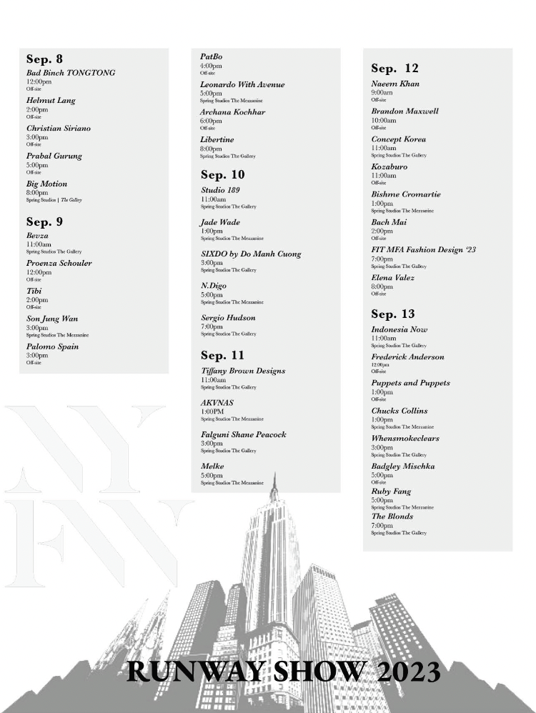
Comps

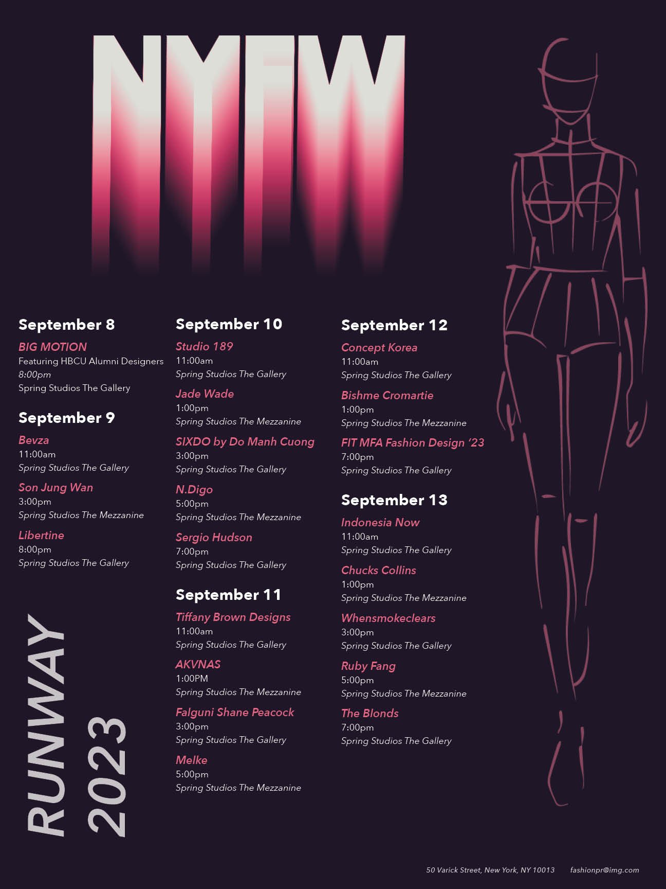
Final Design
Through creating the New York Fashion Week calendar, It’s an example of how design can go beyond limits and make a statement. With every little choice of color, font, and layout, the calendar has become more than just something practical; it's a beautiful tribute to the liveliness of Fashion Week. It speaks volumes about the creativity driving the fashion world, inviting everyone to dive into a colorful journey through the stylish and chic universe of Fashion Week.