
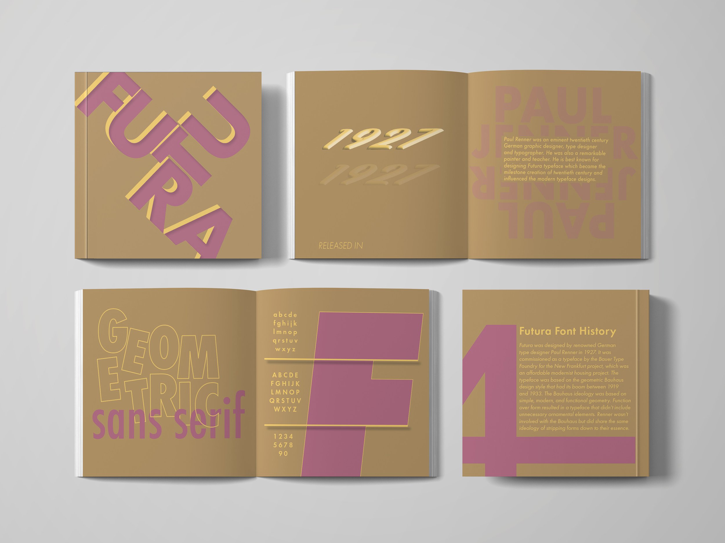
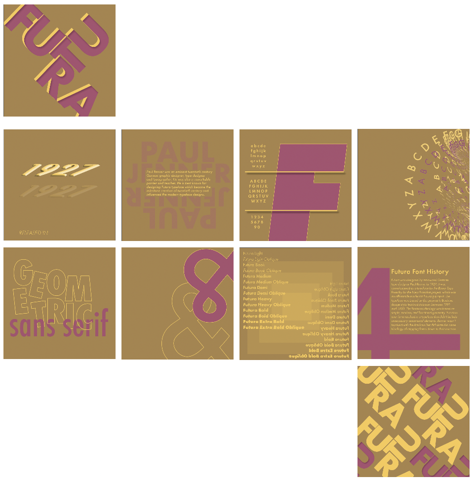
Futura Type Specimen Booklet
This project was a journey of exploration and innovation when it came to focusing on typefaces and the challenge of creating a type specimen book. The primary objective was to craft a visually captivating and refreshingly unconventional specimen book that would challenge traditional design norms while effectively showcasing a typeface of my choosing.
Choosing A Typeface
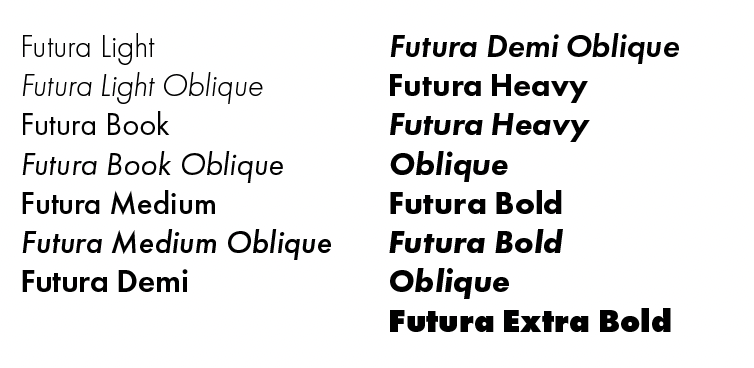
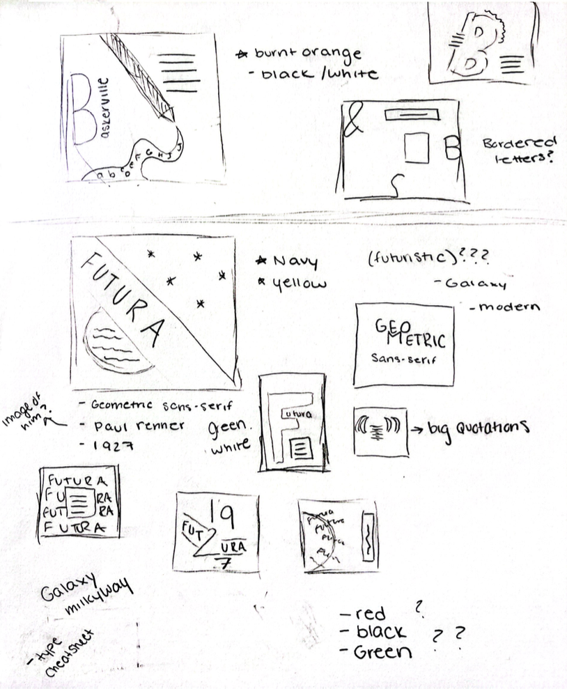
One of my challenges is what font to pick. I grappled with the decision between selecting Baskerville and Futura, two fonts that possess distinct characteristics. Baskerville exudes an air of elegance and vintage charm, whereas Futura embodies a sleek, modern aesthetic with its geometric sans-serif design. Ultimately, I opted for Futura, driven by its contemporary appeal and the creative possibilities it offered for crafting futuristic artwork. The expansive font family of Futura gave me greater artistic freedom. This choice also went seamlessly with my color palette selection, as I aimed to strike a balance between eye-catching visual elements that complemented the sleek and modern sensibilities of Futura.
Color Palette Exploration:
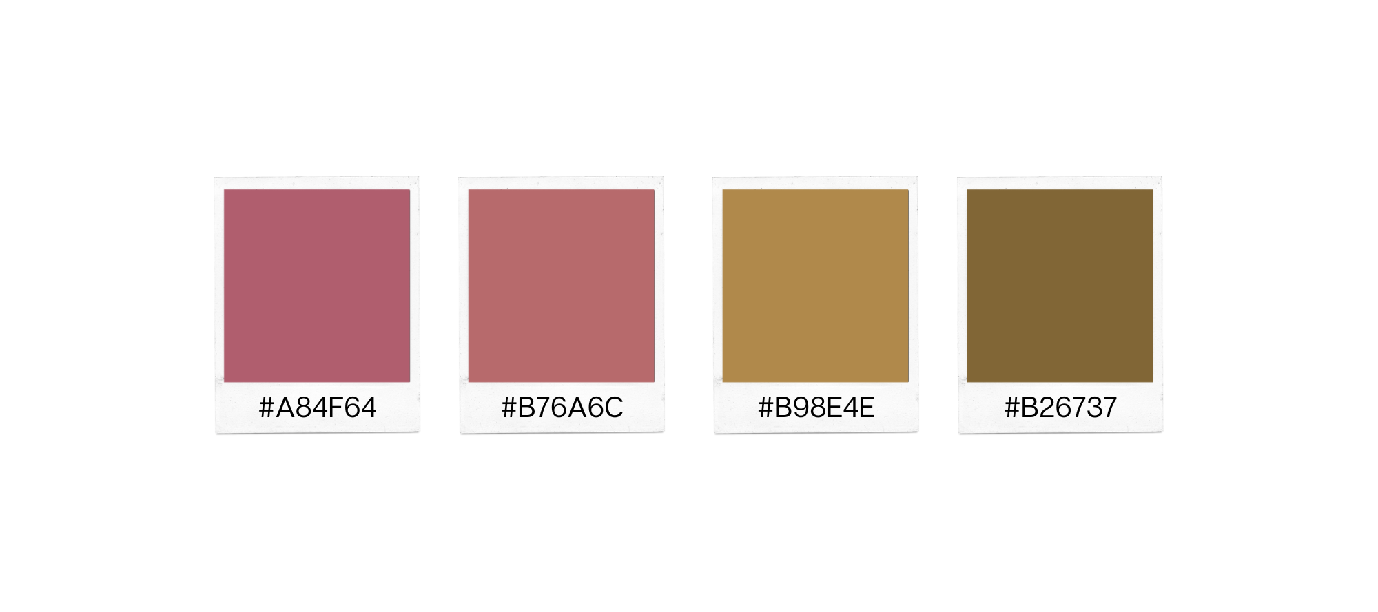
A desire to step out of the comfort zone led to the exploration of various color palettes. Two distinct palettes emerged: one featuring a vibrant green paired with black, and the other showcasing a combination of mauve pink and muted yellow. Both variations were visually appealing, prompting the creation of designs for each. The process of testing and experimenting ultimately led to the selection of the mauve pink and muted yellow palette, which resonated strongly with the project's creative direction.

The Creative Vision
The creative vision for this project aimed to engage viewers on a deeper level by offering an immersive and visually stimulating experience. Embracing experimentation and pushing the limits of design, with the project I sought to break away from traditional layout structures and explore new realms of creativity.
The Process
The design process began with extensive research into various typefaces, exploring their historical contexts and characteristics. This research, combined with an analysis of design trends, gave me a challenge of wanting to go multiple conceptual directions. Initial sketches and mood boards facilitated the visualization and iteration of potential design directions. Throughout the iterative process, feedback from critique sessions guided refinements in spacing, typography hierarchy, and overall composition to ensure coherence across all pages. Meticulous execution using graphic design software, including Adobe Illustrator, allowed for experimentation with typography treatments, color schemes, and layout structures. Geometric layouts and designs intertwined with the typeface were created to enhance visual interest and engagement.
Feedback from peers focused on refining spacing and consolidating impactful pages into a cohesive whole. This input was instrumental in shaping the final design, which benefited greatly from these adjustments. While acknowledging room for further refinement, the evolution of the creative vision in the final product brought immense satisfaction.
Final Design
This type specimen book project shows the power of creativity, innovation, and iterative design processes. By challenging traditional design norms and embracing experimentation with only a few letters and numbers, the final product effectively showcases various typefaces while offering viewers a visually stimulating experience. With there always being areas for improvement, the project's success lies in its ability to evolve and manifest a creative vision that is both captivating and refreshingly unconventional.