
Otis Eats on 8 logo
Otis Eats on 8 (EO8) is a new diner planning on opening that is situated in the Berkshires, just off Route 8. The client sought a logo that not only captured the essence of their establishment but also resonated with the local community. This case study goes into the design process behind creating a logo that embodies the diner's identity and the scenic beauty of its surroundings.
Initial Exploration
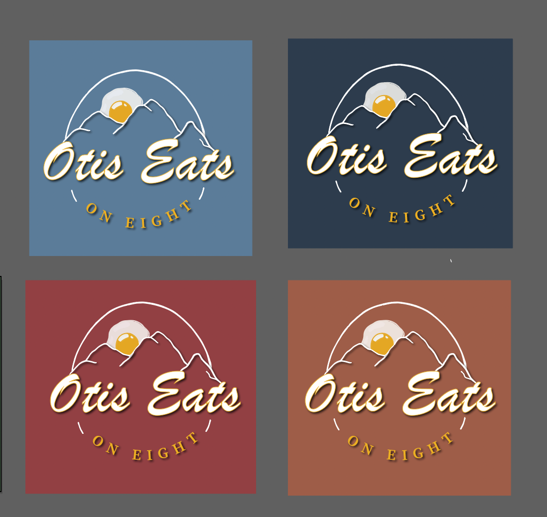
The design journey began with a wide array of color palettes, reflecting the vibrant energy of a diner. Ideas ranged from bold reds and greens to warm oranges. However, it was crucial to align the color scheme with the serene landscapes of the Berkshires but also a color palette that wouldnt ruin any customer's appetite. After thorough exploration, the focus narrowed down to a blend of yellows and blues, evoking the warmth of sunrise and the tranquility of mountains.
More on the process:
The name "Otis Eats on 8" emerged through a collaborative brainstorming session, the goal was to create a name simple and straight to the point but could also be shortened for merchandise and branding purposes, hence EO8 emerged.. It encapsulated the diner's location and its inviting, community-oriented atmosphere. To complement this name, the design aimed to integrate elements that symbolized both dining culture and the Berkshires' natural beauty. Initial concepts included familiar diner motifs like forks and eggs, but they lacked cohesion and failed to capture the essence of the diner.
Taking a Step Back
Refinement became the cornerstone of the design process. Drawing inspiration from the Berkshires' well known terrain, the concept shifted towards incorporating elements of nature. The breakthrough came with the idea of a sunrise which is a universal symbol of new beginnings and the typical time of day for breakfast. However, it was important to infuse this concept with unique elements to differentiate EO8 from conventional diner imagery.
The Breakthrough:
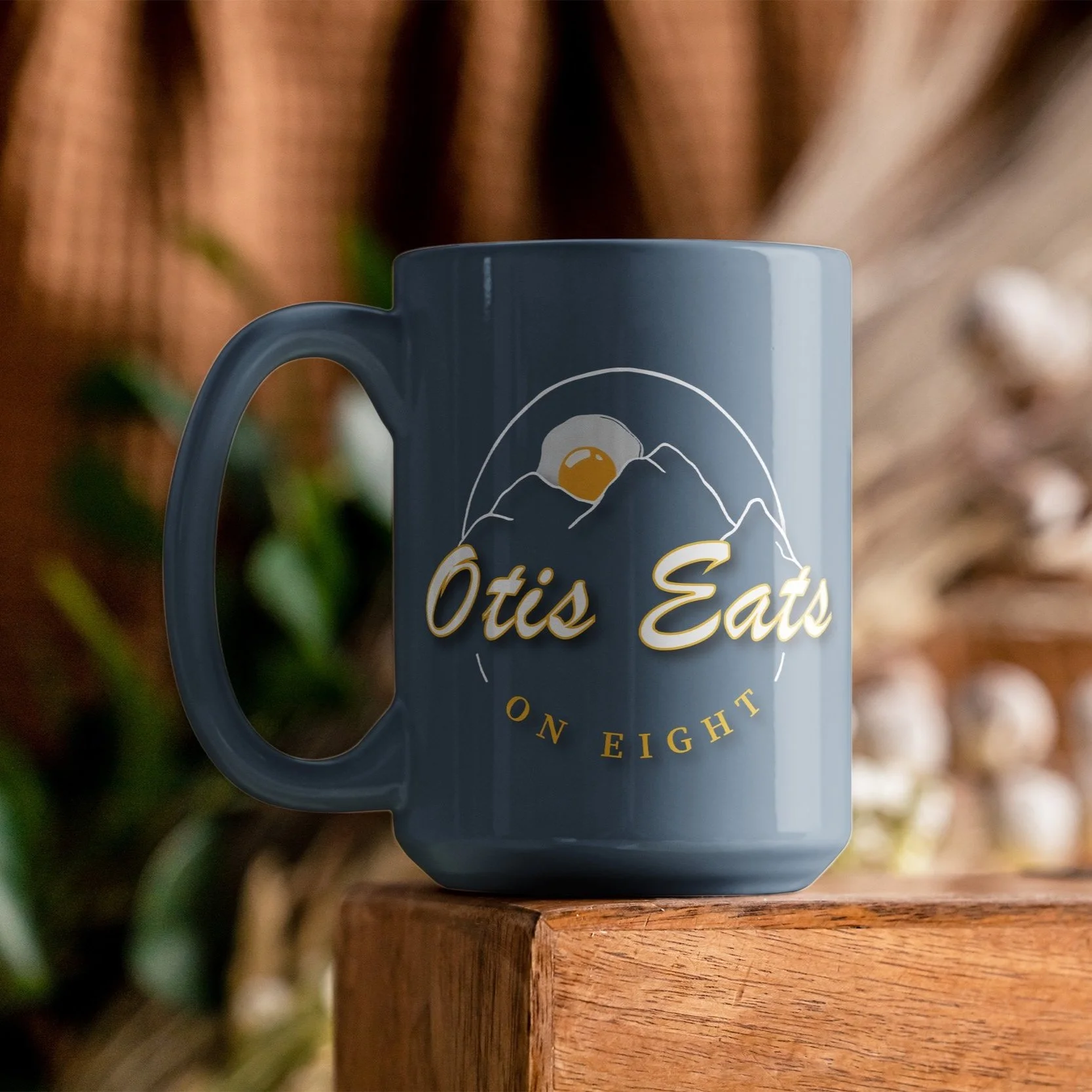
The final logo design seamlessly integrates a sunrise motif with elements reminiscent of the Berkshires' landscape. A sunny-side-up egg is rising above hand-drawn mountains, encircled by the bold typography of "Otis Eats on 8." The choice of colors of warm yellows and blue further reinforces the connection to sunrise and mountain vistas, creating a visually captivating identity. Furthermore, when going back to the shorted EO8 portion of the branding I created a simple tshirt and hat design that used the original fork and knife idea and can be very versatile with its coloring.

The Outcome

The design process resulted in a logo that resonates with both the client and their customers. By combining elements of diner culture with the natural beauty of the Berkshires, EO8's logo serves as a beacon for locals and travelers alike. It not only embodies the spirit of the diner but also establishes a memorable brand identity that sets EO8 apart in the competitive culinary landscape of the Berkshires.
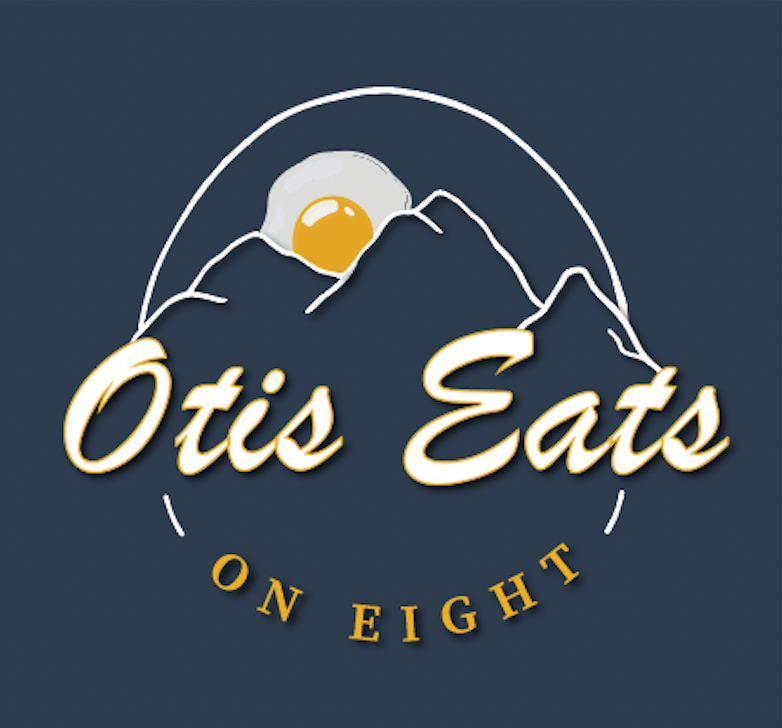
Final Logo
The journey from concept to creation for Otis Eats on 8's logo epitomizes the power of collaboration, creativity, and iterative design. By staying true to the diner's essence and leveraging the inspiration provided by its surroundings, the final logo captures the imagination and leaves a lasting impression on all who encounter it. As EO8 prepares to open its doors, the logo stands as a testament to the diner's commitment to excellence and its dedication to crafting unforgettable dining experiences in the heart of the Berkshires.