
Embracing Minimalism: The Art of Doing More with Less
In the world of graphic design, there's something captivating about minimalism; a philosophy that celebrates the beauty of simplicity or for a more specific definition, “a style or technique (as in music, literature, or design) that is characterized by extreme spareness and simplicity”. Minimalism Is a journey into the key concepts of design, where clean lines, spacious layouts, and minimalist typography combine to create designs that speak volumes by being silent.
As designers, we're often faced with the challenge of reigning in our creativity. With constantly creating multiple sketches, layouts, wireframes and so on, it's easy to feel overwhelmed and tempted to include everything at once but the key is to narrow down the variables.
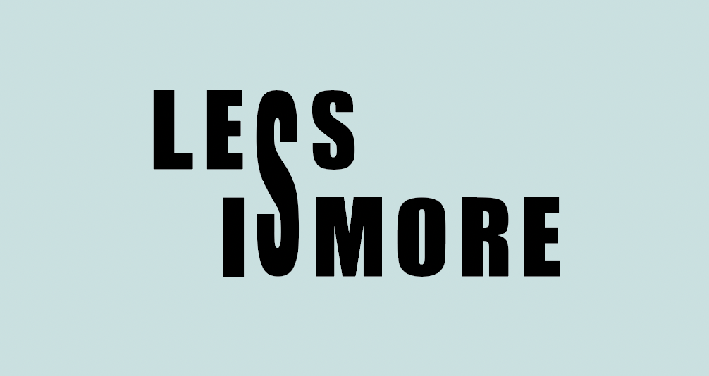
With typography revolving around form and function, it requires a delicate balance and to me is one of the most important to focus on when it comes to minimal details. Typography is about guiding the viewer's gaze towards the core message without overwhelming them with unnecessary distractions. It's about creating designs that communicate effortlessly, inviting viewers to engage and interpret the message in their own unique way or as intended by the artist.
I've personally grappled with the misconception that simplicity equates to simplicity of creation. However, I've come to realize that crafting minimalist designs requires a depth of thought and intentionality. It's about capturing each element with meaning and impact, creating designs that resonate on a deeper level without showing all your cards. Some of my favorite logos and designs, whether created by me or others, are the most simple ones!
Here are some basic tips for creating minimalistic work:
1. Limit your color palette: This doesn't mean sticking to a black and white canvas, but there's power in a pop of color or a concise color palette containing only 1-3 tones. When choosing colors, it's important to consider contrast so that you can direct your viewers' attention to what's most important without overwhelming them with too many hues.
2. Hierarchy: When discussing typography, it's beneficial to choose from a limited font selection and prioritize the placement and hierarchy of the displayed content. Paying attention to aspects such as repetition, alignment, and juxtaposition is also crucial for effective design.
3. Contrast or repetition: It's important to choose between contrast and similarity/repetition. Contrasting elements can create the illusion of “sharpness and dominance,” while similar elements, whether it's a pattern, monochromatic coloring, or more, can give a sense of “harmony.” Either approach can result in a beautifully seamless piece that captures attention effectively.
Simplicity holds a unique charm in design, where the phrase “what you see is what you get” is often not the case. While viewers might initially take things at face value, good design, as Tabitha Emma notes in her article, becomes nearly invisible, encouraging viewers to delve deeper and uncover layers of meaning beneath the surface.
With all that being said my final thoughts to all designers is that minimalism is more than just a design trend, it's a philosophy that celebrates the power of simplicity. It's about stripping away the unnecessary to reveal the essential, creating designs that speak for themselves. So let's embrace the essence of minimalism and allow our designs to shine brightly in their simplicity.

Hi! I’m Brooke Barber.
As a graphic designer I find joy in sharing my thoughts with other creators and the world. My work is a reflection of my education and personal growth over the years and I hope you enjoy both my written and visual pieces.